
This page documents the visual system of the website, including color usage, typography hierarchy, layout standards, and approved content patterns. It is intended to guide your team when creating new pages or updating existing ones. Referencing this guide helps maintain brand consistency, improve efficiency, and preserve the overall design integrity of the site.
Included in this page
Typography
This section defines the website’s font styles, including heading hierarchy and body text. Use the appropriate heading levels and text styles to keep content structured, readable, and visually consistent across all pages.
The website uses Figtree for headings and DM Sans for paragraph text (both Google Fonts). These typefaces were selected to create a modern, light, and slightly playful feel while maintaining strong readability and accessibility across devices. Figtree provides a clean, confident structure for headlines, while DM Sans offers clarity and comfort for longer blocks of text.
Figtree
There are 6 heading styles: H1 through H6. H1 is only for title pages. Below is the sizing of each heading.
H2
H3
H4
H5
H6
DM Sans
For paragraph text, you have the ability to style text in 3 ways: bold, regular, and italicized.
Regular
Bold
Italicized
While standard text sizes are predefined to maintain consistency, the Block Editor also lets you adjust text size (Small through X-Large) when additional emphasis or visual variation is needed. Any size adjustments should be used thoughtfully to preserve hierarchy and overall balance.
Color Palette
This section outlines the approved brand colors for the website. Use only these colors when creating new content to maintain visual consistency and brand recognition. Avoid introducing new or custom colors that are not listed here.
Primary Colors
Used for larger sections and backgrounds.
#314f43
#d9e8c2
#f3efe6
Secondary
Used for cards, buttons, and decorative patterns
#ffd646
#f7e0dd
#fe9b2f
*Orange is specifically used for buttons
Accents
Used to highlight sections that are CTAs, lists, or instructions.
#1e302a
#fffdfa
*When using this color, always use a border color: #314f43 at 1 px to outline
Text Colors
Used for corresponding backgrounds for text to be legible.
#111111
#FFFFFF
Buttons
Here you’ll find the approved button styles and variations. Use these consistently to maintain a clear visual hierarchy and guide users toward important actions. Avoid creating custom button styles outside of these options.
Layout & Spacing
This section explains the standard content widths, section spacing, and layout structure used throughout the site. Following these guidelines ensures pages feel balanced, organized, and consistent.
Layout
There are three available content widths: none, wide, and full.
We primarily use none across the site. However, the full width is used for blocks with a background color that extends to the page edges.
Spacing
50 px
20 px
10 px
Introduction Section Spacer
Use this spacer to separate the introduction sections from the rest of the page content.
Standard Section Spacer
Use this spacer below the header and introductory paragraph to create separation from the main content. It should also be used between distinct content blocks.
Grouped Content Spacer
Use this spacer between related blocks, such as cards, to maintain consistent spacing while keeping grouped content visually connected.
Separator
The separator is used to separate lists, steps, etc., within a block to make the content easier to read.
The automatic color is orange, but for the content, it should be changed to #314f43 (green).
Typically, it’s featured in a block with a background color.
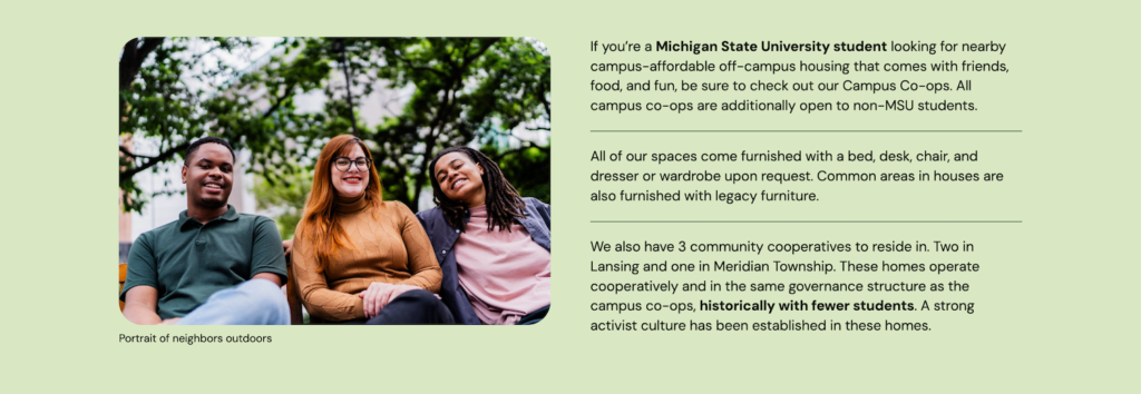
Image Styles
This section outlines approved image shapes, ratios, corner styles, and visual treatments. Use these standards when adding images to ensure visual alignment and prevent distortion or inconsistent presentation.
Primary Image display options
There are a few ways to display images, but the primary ones used are: cover, standard, and media & text blocks.

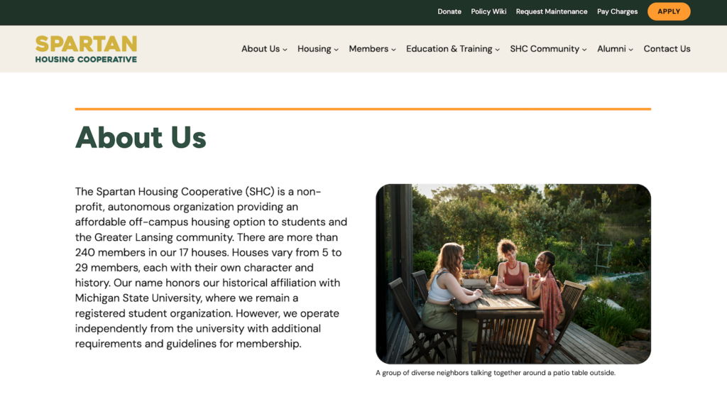

Cover Image
Spans across the width of the page and can include text over an image.
Standard Image
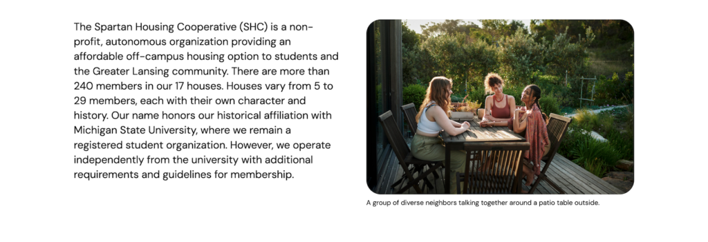
Most commonly used on the site and styled with rounded corners.
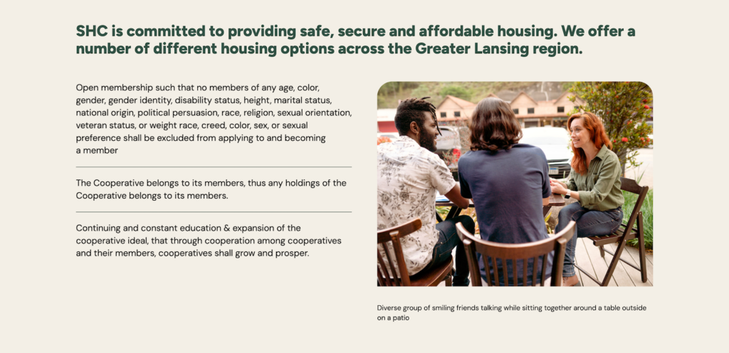
Media & Text
Used to promote or enhance content.
Styling
For standard images, we style for consistency using:
- 3:2 ratio for sizing and cropping of the image
- 30 px radius on all corners to round

Background Image Patterns
There are a few background images of curls in various colors, used as part of the visual branding. They are placed in Media.
You can insert them in a group block by going to Settings > Styles tab > Background Image.
This background image feature should only be used when there is open space at the bottom of the block.
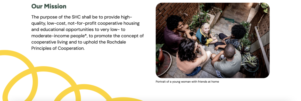
Image File Size Guidelines
Try to keep all images under 500 KB, ideally closer to 200–300 KB. Large image files can slow down page load times and negatively impact user experience.
Best Practices to Include
- Export images at the correct dimensions (don’t upload 4000px images if they display at 1200px).
- Compress images before uploading.
- Avoid uploading images directly from phones or stock sites without resizing.
Card Components
Cards are structured content blocks used for deadlines, quotes, team members, and more. This section shows card layouts and formatting rules to keep content modules uniform and easy to scan.
Styles of Cards
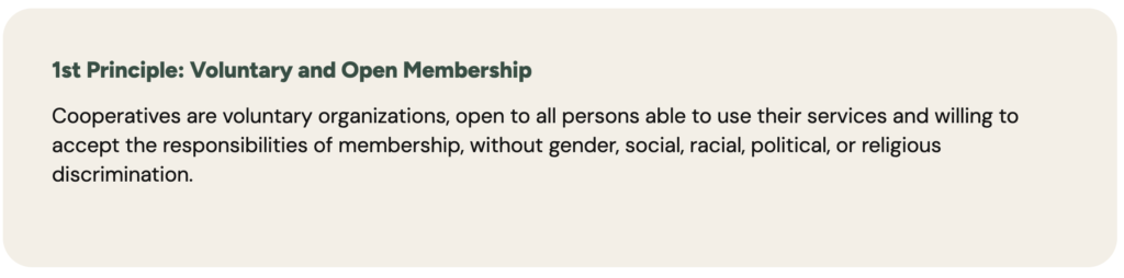
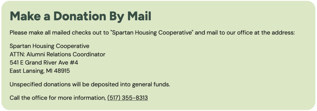
There are a variety of cards to use to distinguish and highlight content. Each is also available as a drag-and-drop pattern. All cards have rounded corners, with sizes varying by card (30 px, 20 px, and 10 px).
Card: Staff
Card: Quote with Image
Card: Quote


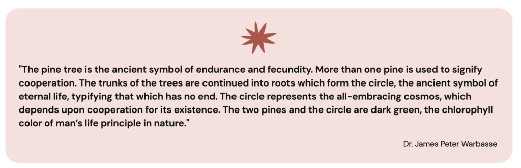
Card: Related information
Card: Reminders and Notes
Card: Informational

Icons
Here you’ll find the icon style, size, and usage guidelines. Use consistent icon styles to maintain visual harmony and avoid mixing the icon sets.
There are 3 icons used solely to indicate that a card block is a quote.



Block Patterns
This section includes pre-built layout patterns that can be inserted into new pages. Use these patterns to build pages efficiently while preserving the site’s design system. Modify only the approved content areas within each pattern.
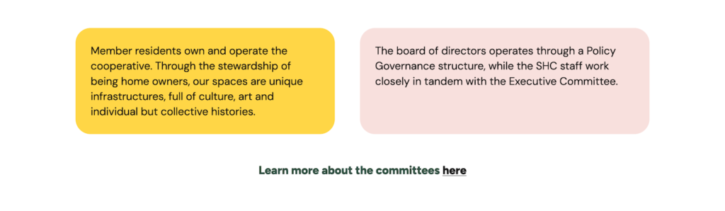
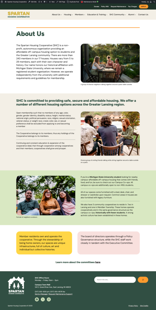
Example of how to use patterns to build a page:
Basic Accessibility Guidelines
These guidelines help ensure the website remains usable for all visitors. Follow these best practices when adding content to maintain proper contrast, structure, and clarity.
- Don’t use light text on light backgrounds
- Always add alt text to images
- Use heading hierarchy properly
- Avoid using color alone to convey meaning
Do’s & Don’ts
This section highlights best practices to follow and common mistakes to avoid when updating the website. Reviewing this before publishing new content helps preserve design integrity.
Do
- Use approved patterns
- Keep section spacing consistent
- Use primary color for key CTAs only
Don’t
- Add custom colors
- Stretch images out of ratio
- Reduce padding to “fit more content”